Free shipping on all domestic orders over $150
Free shipping on all domestic orders over $150
Shop
Add description, images, menus and links to your mega menu
A column with no settings can be used as a spacer
Link to your collections, sales and even external links
Add up to five columns
Add description, images, menus and links to your mega menu
A column with no settings can be used as a spacer
Link to your collections, sales and even external links
Add up to five columns

The power of color
September 27, 2021 2 min read
We had a lovely knitter in the shop some years ago looking to knit for a basic sweater. “Top down,” she said, “with a round neck and long sleeves,” and added, “Preferably worsted weight.” Ginni found her a Knitting Pure and Simple pattern for a basic top-down sweater with a jewel neck and long sleeves. And what do you know--worsted weight. Perfect, huh?
The knitter looked at the pattern and slowly shook her head, “No, this one is not right.”
Unflustered, Ginni said, “Ok, so I can find you a pattern that is right, can you tell me what it is about this one that is not right?”
“Well,” she answered, “this is brown, and I really wanted a blue sweater.”
We can laugh at this exchange, but there is a bit of that knitter in all of us. Whether or not we like a color plays a powerful role in our decision making. I have absolutely chosen to knit a sweater that was all wrong for me simply because I loved the color. And I have looked past some beautiful designs shown in a palette that didn’t call to me.
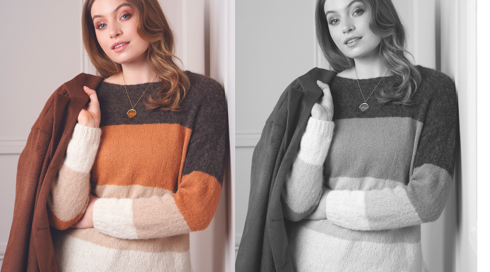
How do we get past this? Back in the days before everyone had a DSLR-quality camera with photo-editing software in their pocket, Sally Melville advised knitters to put the pattern on a photocopier which took color out of the equation and showed everything in grayscale.
Now, of course, we can take a screenshot of the pattern picture and edit the saturation to zero to get the same effect. Either way, it’s super helpful to remove the distracting color so we can decide whether or not we like the sweater’s style and details.
This little trick is especially helpful if you’re working with multiple colors in a sweater. It’s easier to swap colors if you can see that you need one light, one medium, and one dark. Or two mediums, one light, and one dark. Line up your potential substitute colors and take a black and white photo to see if you’ve captured the designer’s vision in your new palette.
I’ve been doing this with two of the striped sweaters in the Rowan Mode Collection Five. I want to swap out the warm spice colors for tones that will work with other sweaters I’ve knit recently and help me update my hand-knit capsule wardrobe this season.
It’s fun to have things that work together, and I love how we can repeat the colors, and even the actual yarn, to make a cohesive wardrobe of handknits we can layer and wear in multiple ways. This is what I'll be talking about on the podcast this week.
I would love to help you figure out alternate palettes and start creating a handknit wardrobe you love to wear. If you are local, stop by the shop. If not, contact me via email or on instagram and let me know how I can help.
I look forward to seeing you in the shop or in our virtual spaces. You are always welcome here.

